
The Visualization tab plots numeric values from a Topic as a time-based line chart. It is useful for inspecting trends in event data, comparing values across Partitions or message fields, and quickly spotting changes in a stream without exporting messages to another tool.
Open a Topic in the browser and select the Visualization tab. The page reads messages from the selected Topic, extracts the configured timestamp and value, and draws the results in a chart. The horizontal axis is always a timestamp. The vertical axis is a numeric value read from the message key, value, or a header.
The Visualization tab is available from a Topic. It uses the Topic's configured key and value decoders when message key or value data is selected in the settings. If the Topic has saved visualization settings, those settings are restored when the Topic is opened. Otherwise, Offset Explorer uses the default visualization settings from the global application settings.
Before running the chart for the first time, choose the settings that describe where the timestamp, value, and optional series information are located in your messages. After the settings are saved, click Run to load messages and draw the chart.
The toolbar at the top of the page controls loading, message range, partition selection, and chart settings.

| Control | Description |
|---|---|
| Run | Loads messages using the selected range and Partition options, then redraws the chart. |
| Stop | Stops the current message load. The status bar changes to canceled and no more records are added. |
| Settings | Opens the Visualization Settings dialog. Saving the dialog stores the settings for the Topic and reloads the chart. |
| Save as PNG | Saves the current chart image as a PNG file. The saved image uses the chart's current visible range, including any active zoom. If the selected file already exists, Offset Explorer asks before replacing it. The save dialog remembers the last folder used for visualization exports. |
| Messages | Chooses where reading starts. Newest reads from the newest available messages, Oldest reads from the beginning of the Topic, From Timestamp reads messages at or after the selected timestamp, and From Specific Offset reads from a numeric Offset in one selected Partition. |
| Timestamp field and calendar button | Shown when Messages is set to From Timestamp. Enter a timestamp directly or use the calendar button to pick one. When the field is empty, Offset Explorer fills it with a recent timestamp. |
| Offset field | Shown when Messages is set to From Specific Offset. This mode requires one selected Partition because Kafka Offsets are Partition-specific. |
| Partition | Selects one Partition or all Partitions. When all Partitions are selected, the Max Rows per Partition setting is applied per Partition. |
The status bar at the bottom of the page displays the load state, number of scanned messages, total bytes, and elapsed time. It also contains the Max Rows per Partition field. This field limits how many messages are read from each selected Partition and is saved with the browser window settings.
While a load is running, the toolbar controls that would change the request are disabled. When loading finishes, the status changes to ready. If the load is canceled or fails, the status bar shows the corresponding state.
The chart displays one or more line series. The X-axis shows timestamps, and the Y-axis shows the numeric value selected in the settings. Hovering over a data point shows its timestamp and value. When the chart has more than one series, the tooltip also shows the series name.
When aggregation is enabled, each plotted point represents a time bucket instead of an individual message. The tooltip shows the bucket time range, the aggregate value, and the number of records included in that bucket.
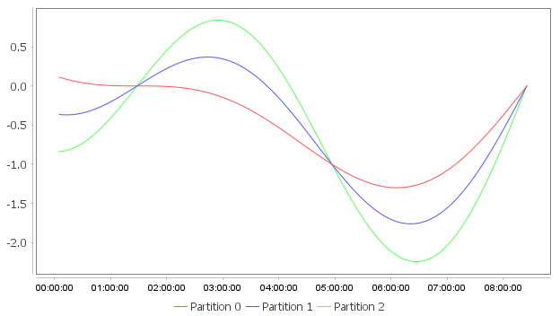
If more than one series is displayed, a legend appears. Click a legend item to hide or show that series. Hidden series are drawn in a light gray color in the legend so they can be restored later.
Drag inside the chart area to zoom into a range. Right-click the chart to open the chart menu. Reset Zoom is enabled after the chart has been zoomed and restores the axes to their automatic ranges.
The chart menu can save the current chart as a PNG file, save visible chart data as a CSV file, or copy
visible chart data to the clipboard as CSV. Hidden series and points outside the current zoom range are not
included in CSV output. No Aggregation CSV contains series, partition, offset,
timestamp, x, y, and count. Aggregate-mode CSV contains
series, timestamp, x, y, and count.
In No Aggregation mode, count is 1 for each plotted message. In aggregate mode, count is the
number of records in the bucket.
In No Aggregation mode, click a data point or right-click a point and choose Go to Message to open the Data tab at that point's source Partition and Offset. Aggregated points do not offer message navigation because one point can represent multiple records.
Timestamp labels use the Today Timestamp Format when all plotted points are from the current day. Otherwise, the chart uses the Timestamp Format. Both formats are controlled in the settings dialog.
The Settings button opens the Visualization Settings dialog. The dialog contains X-Axis, Y-Axis, Series, and Options tabs. Click Save to validate the settings, store them for the Topic, close the dialog, and reload the chart. Click Cancel or close the window to discard changes.
Many settings have a help button next to the control. The help text explains what the setting means and when it is required.
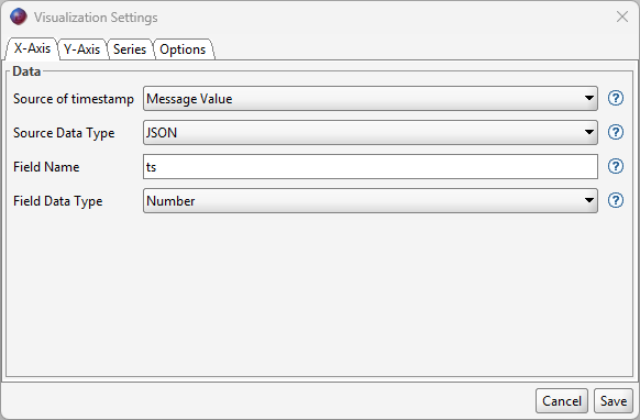
The X-Axis tab defines the timestamp used to place each point horizontally on the chart.
| Control | Description |
|---|---|
| Source of timestamp | Selects where the timestamp comes from. Message Timestamp uses Kafka's message timestamp. Message Key, Message Value, and Header read the timestamp from message data. |
| Header Name | Shown when Header is selected. Enter the name of the header whose value contains the timestamp. |
| Source Data Type | Shown for Message Key, Message Value, and Header sources. Single Value uses the entire decoded value. JSON parses the decoded value as JSON and reads the value specified by Field / Path. |
| Field / Path | Shown when Source Data Type is JSON. Enter the JSON field or path that contains the timestamp. See JSON Field / Path Syntax. |
| Field Data Type | Select Number when the source value is a numeric timestamp in milliseconds. Select Date String when the source value is text that must be parsed with a date/time pattern. |
| Field Format |
Shown when Field Data Type is Date String. Enter the Java date/time pattern used to parse the source
value, such as yyyy-MM-dd'T'HH:mm:ss.SSS.
|
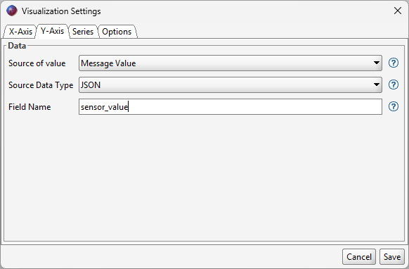
The Y-Axis tab defines the numeric value plotted vertically for each message. Values that cannot be parsed as numbers are counted as processing failures and are not plotted.
| Control | Description |
|---|---|
| Source of value | Selects whether the numeric value comes from the message key, message value, or a header. |
| Header Name | Shown when Header is selected. Enter the name of the header whose value contains the numeric value. |
| Source Data Type | Single Value uses the entire decoded value. JSON parses the decoded value as JSON and reads the value specified by Field / Path. |
| Field / Path | Shown when Source Data Type is JSON. Enter the JSON field or path that contains the numeric value. See JSON Field / Path Syntax. |
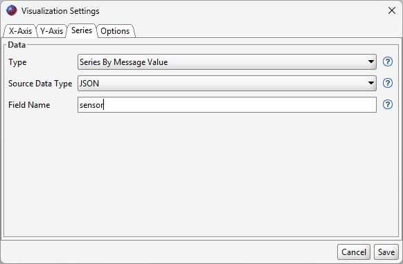
The Series tab controls how points are grouped into chart lines. A chart can show a single line or multiple lines based on Partition, message key, message value, or header value.
| Control | Description |
|---|---|
| Type | Single Series draws every valid point in one line. Series By Partition creates one line per Partition. Series Per Message Key groups records by key. Series By Message Value groups records by value. Series By Header Value groups records by the selected header value. |
| Header Name | Shown when Series By Header Value is selected. Enter the header name used for grouping. |
| Source Data Type | Shown when grouping by key, value, or header. Single Value uses the entire decoded value. JSON reads the value specified by Field / Path from the decoded JSON value. |
| Field / Path | Shown when Source Data Type is JSON. Enter the JSON field or path used as the series label. See JSON Field / Path Syntax. |
The chart supports up to 50 series. If more series are found, additional series are skipped and Offset Explorer reports a warning.
When Source Data Type is JSON, Field / Path selects one scalar value from the decoded JSON message key, value, or header. The selected value must be a string, number, boolean, or null. Objects and arrays cannot be plotted directly.
| Syntax | Description |
|---|---|
latencyMs |
Reads a simple field name. This keeps existing visualization settings compatible. |
payload.metrics.latencyMs |
Reads a nested value using dot-separated object fields. |
items.0.latencyMs |
Reads a value from an array element by numeric index. |
/payload/metrics/latencyMs |
Reads a value using JSON Pointer syntax. |
Use JSON Pointer when a field name contains a dot or slash. JSON Pointer uses ~1 for a slash and
~0 for a tilde, so /payload.metrics/latency~1ms reads the field named
latency/ms inside payload.metrics.
The Options tab contains additional settings organized into Data, Timestamp, Background, and Series tabs.
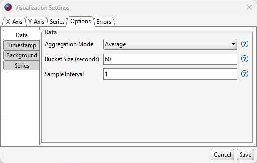
Aggregation Mode controls whether the chart plots individual records or combines records into time buckets. No Aggregation plots individual records. Average, Min, Max, Sum, Count, and P95 produce one plotted point per series for each bucket that contains records.
Bucket Size sets the time range, in seconds, used for each aggregate point. For example, a bucket size of 60 creates one aggregate point per minute. Buckets are based on the configured X-axis timestamp. Count uses the number of records in the bucket and does not require a Y-axis value; the other aggregation modes use the numeric Y-axis value.
| Mode | Description |
|---|---|
| No Aggregation | Plots one point for each sampled record. |
| Average | Plots the average Y value for records in the bucket. |
| Min | Plots the smallest Y value in the bucket. |
| Max | Plots the largest Y value in the bucket. |
| Sum | Plots the total of the Y values in the bucket. |
| Count | Plots the number of records in the bucket. |
| P95 | Plots the 95th percentile Y value in the bucket. |
Sample Interval controls downsampling after the selected data shape is produced. In No Aggregation mode, it skips loaded records before plotting. With aggregation enabled, Offset Explorer first reads all records into time buckets and then Sample Interval skips completed buckets. A value of 1 plots every record or bucket. A value of 10 plots every tenth raw record or every tenth aggregate bucket.
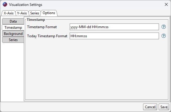
Timestamp Format controls the X-axis and tooltip format when any plotted point is outside the current day. Today Timestamp Format controls the display when every plotted point is from today.
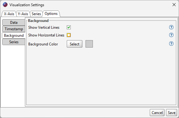
Show Vertical Lines and Show Horizontal Lines control the chart grid lines. Background Color opens a color chooser and shows the selected color in a swatch next to the Select button.
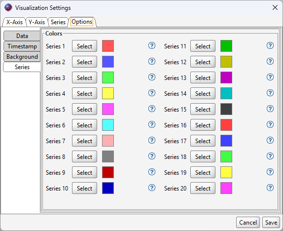
The Series tab contains color selectors for Series 1 through Series 20. Each row has a Select button and a color swatch. Colors are assigned to visible series in chart order. If the chart has more series than configured colors, Offset Explorer uses the chart's default colors for additional series.
Offset Explorer validates the settings before loading data. Required header names, JSON field paths, timestamp formats, aggregation bucket size, sample interval, custom Offset, and start timestamp must be valid before the chart can run.
Messages that cannot be converted into valid chart points are skipped. For example, a missing header, invalid JSON value, missing JSON field/path, unparseable timestamp, non-numeric Y value, or too many series can produce a warning. If every loaded message fails, the page reports an error instead of drawing a chart. If some messages are valid and some fail, the valid points are drawn and a warning lists the number of failures.